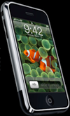
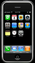
"It works just like they show on tv!"
I've been thinking about why this should still be happening. It's been over seven months since the product hit the marketplace, and just over a year after it was announced, with great fanfare, and an unprecedented wealth of detailed online information and demonstrations at apple.com/iphone.
The continued amazement people exclaim when they first see an iPhone is a direct result of the way other companies advertise their phones. It causes people to simply and subconsciously dismiss what they see in the iPhone commercials. It can't possibly be that simple. It can't possibly do that much stuff. Those animations have got to be mock-ups, the real phone never works like you see in commercials.
In both television and online ads, and at vendor web sites, there is a tremendous amount of Exciting Animation!!! In marked contrast to Apple's approach, almost none of the animation from any other phone vendor actually shows you what happens on the phone.
What's revolutionary, really remarkable for any kind of tech advertising, really, is that in the iPhone commercials, the iPhone doesn't move.
Look at every other ad, even older iPod ads, and you'll see lots of dancing and jogging and flying gadgets. In iPhone commercials, the iPhone is big, and clear, front and center, and above all, stationary. iPhone doesn't move. All the motion conveys information. A finger flicks, a screen slides aside to make way for another. A finger pokes a button on screen, and weather information rises out of it, the "Djinni Effect", named by Apple for the cloud of smoke emerging from the lamp, from which the Djinni solidifies.
Notice the homage to the classic phone industry's "flying gadget" commercials, at the very end of every iPhone commercial. The only time the device is in motion is when the phone rings, and it's answered. The iPhone, in hand, slides to the side of the frame, similar to how you would see it as you lifted it to your ear. That is the only time in any iPhone commercial when the device moves.
The entire conceptual frame of the iPhone commercials is intentional, and derived from a design philosophy that Apple several years ago named, "User at the Center". The user is inside the iPhone commercial, as a viewer, it's easy to get pulled in, imagining it's your hand holding the phone, your finger that flicks the scrolling list, your ear to which the phone is lifted at the end when your friend calls.
Contrast every other phone, every other advertisement.
A year after Apple's approach to this product became clear, Nokia has just released the N96, which they hope will hold its own against iPhone. Click on the "Take a look" button for a peek at the very latest high tech pocket phone gadget, the Nokia N96. You'll be treated to an explosion of commotion, but really none of it giving you a sense of how to actually use the device, or how it might respond.
Why? Symbian, the system software on the Nokia phones, although it's undoubtedly improved over the N95, still sucks. Using the device is cumbersome and clunky. They can't show it to you in detail, because it would just point out how far behind they really are.
This same problem now haunts the other vendors, as well, regardless of which family of system software they're using, PalmOS, the Symbian variants, Linux, or Windows Mobile.
Blackberry takes the same basic approach in both their online animated gif ads, which basically show an updated variation of a "dancing line" style screen saver, which isn't something that actually runs on the phone, and also in their television ads, which use a tremendous amount of motion and animation, none of it related to what the phone actually does.
Blackberry's internal name for this ad campaign is "Hollywood Musical".[1] That's a cynical reference to the tendency in Hollywood musicals to substitute distraction and commotion for advancing a plot or developing characters through a story-line in any discernible way.
Seen on television by the same people who see Apple's iPhone ads, these "distract them with commotion" ads serve only to make Blackberry look impotent. They point out, in glaring brilliant white spotlights, the dramatic contrast with the obvious sexual potency of iPhone, a device from a future so bright it was only hinted at in science fiction before it actually arrived, a device that responds instantly to the slightest touch of your finger.
Sprint takes the gold star here, with a brilliant ad campaign. They realized how lame it was to try to fight back against Apple on Apple's own turf while Sprint was handicapped, with their only weapons being flashy animation and distraction.
Sprint said, no, we've got to move the game to another field altogether. We can't win a head-to-head against commercials showing real things really happening on a real iPhone. We just wind up looking lame if we take the Blackberry approach to using animation as a distraction.
Sprint moved the game. Their brilliant series of "Flashlight" commercial focus not on the service, and not on the devices. Instead, they focus the commercial on the commercial itself, the unusual, beautiful, and cool advertisement, a moment of curious and pleasant art, brought into your life by the benevolent and generous multinational corporation, Sprint, with just a dash of fantasies, hopes, and dreams thrown in for good measure.
Of course, it remains to be seen if these feel-good commercials can really do anything to stem the tide of smart phone users flowing from Sprint as their contracts expire, to AT&T. But they definitely get an E for Effort.
What Sprint is Selling (Dreams)...
What You Actually Get From Sprint...
And a nice little documentary, The Making of the Sprint Flashlight Commercials...
NOTE 1: OK, I made that up, about Blackberry's internal code name for their ad campaign. But it could be true. It should be true. In a metaphorical sense, it is true. I have no idea what their internal code name for this ad campaign was. Maybe it's "Surrender" or "Horked" or "Desperado".


No comments:
Post a Comment